The Addams Family

The Brief.
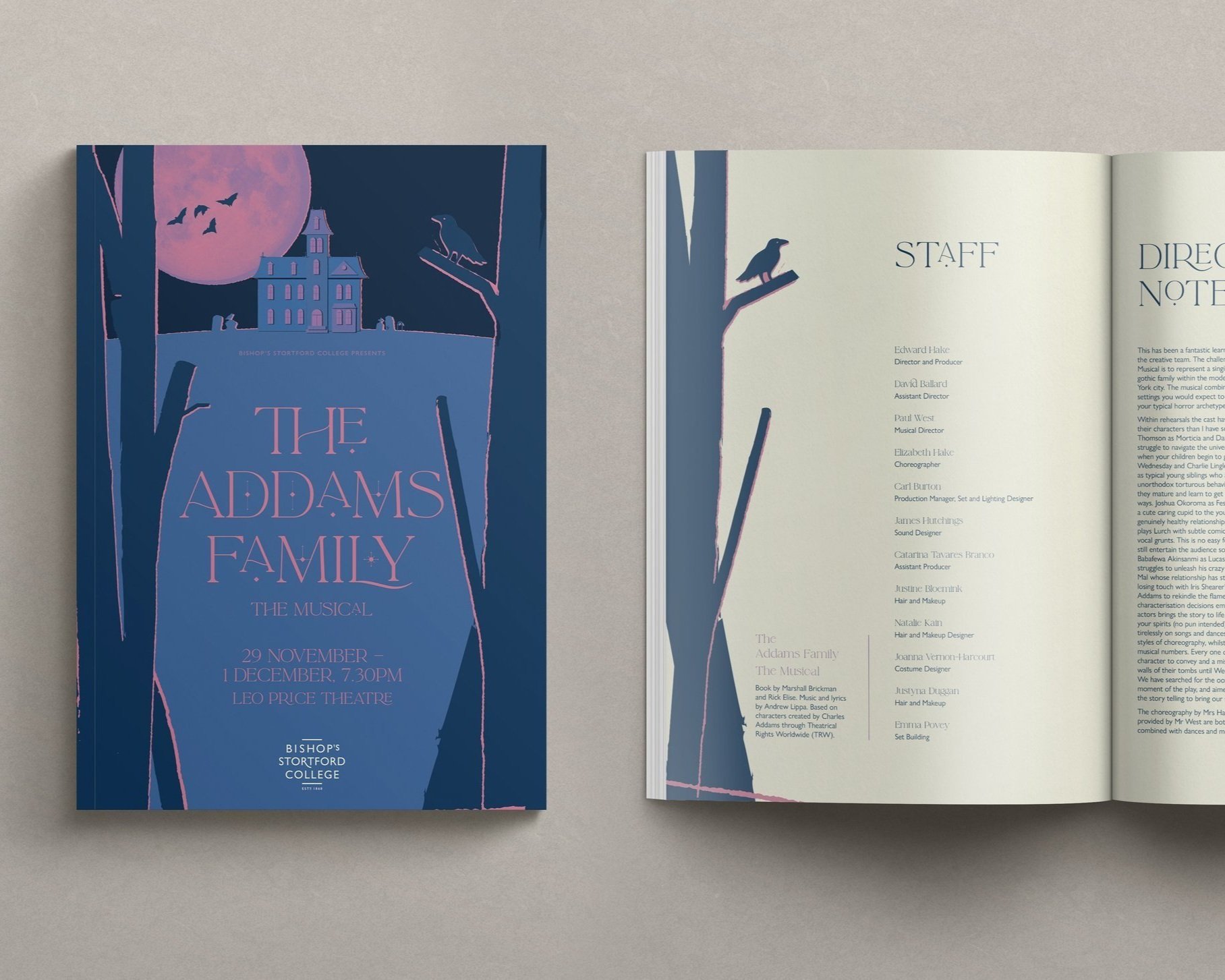
Key art for Bishop’s Stortford College’s theatre production of The Addams Family Musical, with marketing assets to be used across print and digital channels to entice audiences and encourage ticket sales.

The Design.
The typical tropes of this well-known story are present; bats, the castle, gravestones (with a playful zombie hand even breaking through the surface for particularly eagle-eyed viewers, a nod to the dark humour of the original show) however a colour pallet of blues, purples and pinks breathes life into the Gothic genre. The typography is also modern in style whilst feeling aptly cabalistic.
The graphic style is rugged, offset and scratchy. Like a bad montage or rough screenprint. This is uncomfortable yet interesting viewing. It’s slightly off, creepy and kooky, mysterious and spooky...
The Design.
I wanted to create a vintage look, full of texture and imperfection. To achieve this I broke the artwork down into colour layer separations, as would be done to prepare an artwork for screen printing. Each layer was then subject to a process of rasterizing, applying textures, and outlining again to vectorise the artwork.


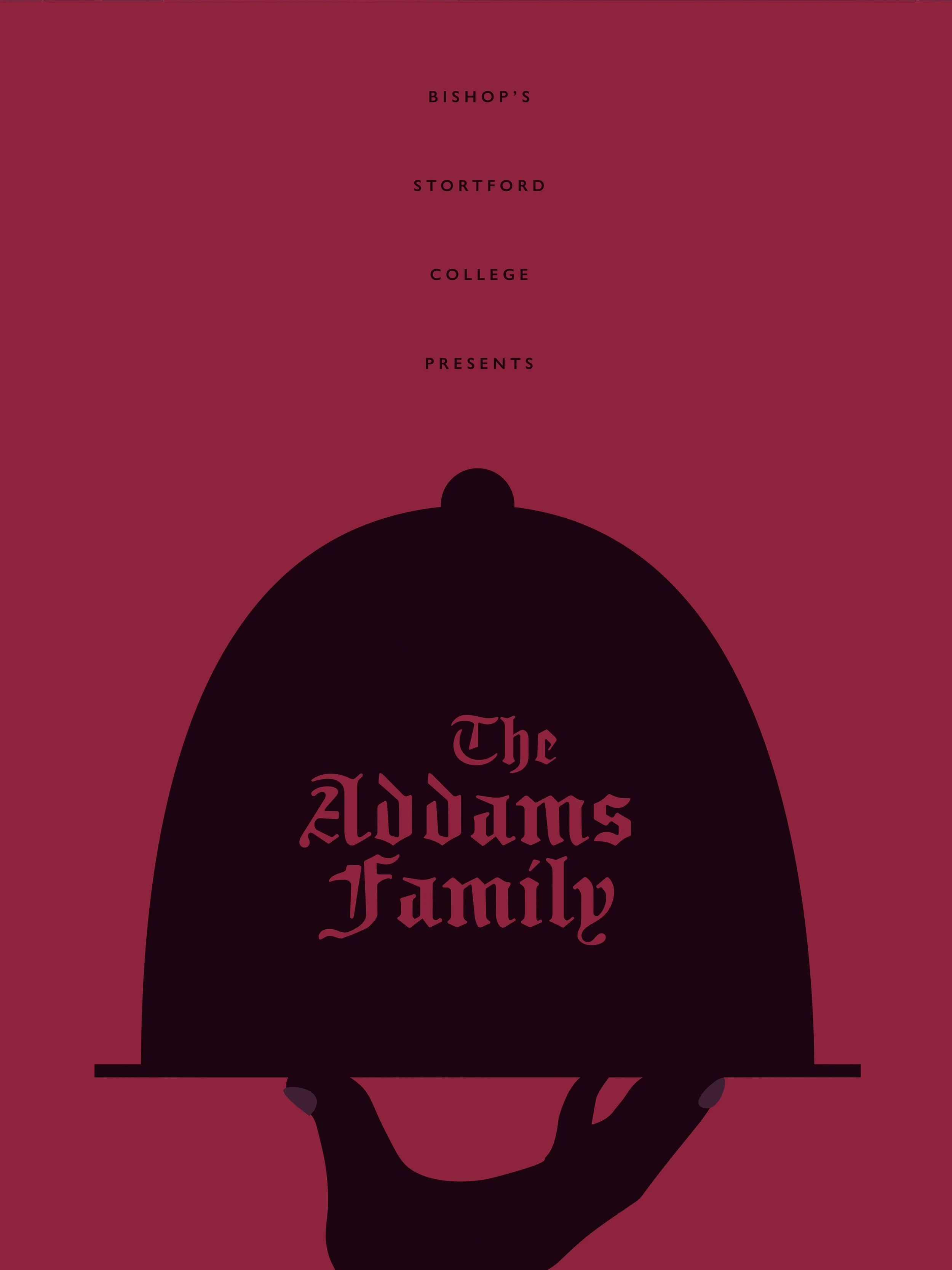
The Concept.
When sketching up initial concepts, I wanted the poster to be minimal in content and style, but use the image and text elements to create leading lines, directing the viewers’ gaze.
These ideas play around with scale and balance within the space, and were developed into the drafts shown below.
From this starting point, in conversation with the Drama department, we proceeded with the first option, using the mansion as the visual anchor. Whilst the atmosphere of the dominating moon was liked, with the full text added in the effect was lost. Moving the mansion to the top quarter gave ample space for the necessary information, and nicely playing on the feeling of being buried under the ground.
-
![]()
Direction A: Super Moon
-
![]()
Direction B: Thing
-
![]()
Direction C: Typographic Gothic